This webinar introduces a partnership between PowerOutage.com and Juvare’s WebEOC platform, demonstrating how real-time power outage data can enhance emergency operations and situational awareness. The presentation covers PowerOutage.com’s comprehensive data aggregation from nearly 1,000 utilities across North America, providing 97% coverage of US metered parcels. The integration includes four key components: live outage API with 10-minute updates, historical data dating back to 2017, enterprise outage alerts for critical infrastructure, and CSV reporting capabilities. The demo showcases WebEOC dashboards displaying outage information at national, state, county, and utility levels, with both JSON-based data and GeoJSON polygon/point mapping for precise geographic visualization. The webinar addresses the growing challenge of weather-related outages, citing recent storms that affected millions of customers and caused billions in economic losses. The Q&A session covers technical aspects like data reliability, coverage gaps, and real-time capabilities, emphasizing how this integration helps emergency managers make data-driven decisions during power emergencies.
Transcript:
Okay. Let’s get started.
Thank you all for joining our webinar today titled from outage to action, real time power intelligence driving emergency operations.
Before we begin, just a few housekeeping items. This session is being recorded and will be shared with all registrants after the event. All attendees are muted by default to minimize background noise.
Submit any questions anytime via the q and a panel. We’ll address them live as time allows and follow-up directly on any we miss.
If you’re experiencing technical issues, try refreshing your browser or simply leaving and rejoining the session.
We’ll have two poll questions today. We’d love your input on these.
The length of our event today is about forty five minutes. And after the event, we’ll send you the recording and a short survey for for for your feedback.
Today’s agenda, we’ll welcome today’s speakers.
We’ll get an introduction of our partner power outage dot com. We’ll get an overview of the integrated power outage product portfolio, and we’ll see a demo of power outage integrated within WebEOC.
We’ll talk about our future webinars, talk about how to learn more, and we’ll wrap up with all of your questions.
Today’s speakers, Matt Hope is chief executive officer of PowerOutage.com.
Doug Bocha is chief revenue officer at PowerOutage dot com.
Matt Cronin is VP of solutions engineering here at Jabari. And I’m Jeff Erkovich, director of partnerships at Juvare.
Before we go any further, I’d like to present our first poll question.
Would love your input on this.
During a significant power outage, what is your biggest operational challenge?
I’ll give you about a minute to answer that. These poll questions really help us out.
Great.
You guys are really on the ball today. Everybody’s answering really quickly. It’s great.
K. A few more seconds.
Fantastic. I’m gonna go ahead and end the poll. Still a couple. Excellent. Thank you very much.
And with that, I’ll turn things over to Doug. Doug, take it away.
Thanks, Jeff. Appreciate the opportunity to be here today and the opportunity to talk about the partnership that we’ve created with, Jabari and WebEOC. So I I really wanted to start with the rationale of why we made the decision to integrate and why it was really kind of an easy decision for us. So when we spoke to you guys and we’re thinking about the use cases and functionality of WebVOC, it really revolves around real time situational awareness and operational visibility to drive business continuity, business planning, risk mitigation, and community support. And when we look at the use cases of when our clients have come to us over the years, they overlap seamlessly.
So it just seemed like a really easy decision to be able to integrate this data into WebEOC, and it really created a a kind of an organic and natural extension of the services that we both provide to clients. So when you think about it in that lens and that that frame of of business continuity and real time situational awareness, access to the grid really matters. Because access to electricity is just it’s a building block of modern civilization, and we live in an increasingly digital world. And being able to access electricity provides that, you know, essential functionality for businesses, whether they’re public or private, governmental agencies, and consumers themselves.
And when when access to power is disruptive, it is it can be, obviously, disruptive, but also extremely costly. Department of Energy estimates that there there is a hundred and fifty billion dollars of lost productivity and damage each year due to outages. And unfortunately, I think everybody would agree that to this because everyone’s experienced it. It’s not really a question of if. It’s really a question of when are you gonna wind up experiencing an outage.
And because we partner with utility companies directly, and I promise you they work as hard as they possibly can to maintain access to the grid because they are regulated industries, and they are judged primarily on their ability of uptime.
But we all know that unplanned outages are gonna wind up occurring, and roughly about eighty percent of those unplanned outages are caused by weather related events. And by all accounts, weather is getting more extreme, it’s getting more volatile, and that pattern is expected to continue for years to come. And when that happens, those power outages can be extremely disruptive, extremely costly, and in some cases dangerous. And I think the timing of this call is somewhat interesting in that you you really don’t have better examples than the last five to six weeks over the over the course of the country because about five and a half weeks ago, we had winter storm firm. So historic ice storm that stretched from Texas to the mid Atlantic states over the course of that storm and the path of that storm that impacted it caused pretty significant outages across ten states.
There were over two million outages that happened over the course of the storm. And at its peak, there were over one point one million customers that were out. Literally a week later, there was a storm that raced across the southern United States, formed the nor’easter off the Carolina coast, And, thankfully, it wasn’t as bad as what, folks thought, but it did did cause some pretty wide scale outages across Northern Georgia and the Carolinas with snowfall there. And then just a week and a half ago, we had another nor’easter that ripped up the East Coast, the winter storm, Hernando, historic snowfall in the New England area, hurricane force winds.
And at its peak, there were over six hundred and fifty million customers that were out without power. So if it’s if it’s really a question of when this is gonna wind up occurring, having access to power outage data becomes a universally contextually relevant signal that would allow any entity, whether you’re a public or a private business, a governmental agency, to automate the detection of outages as they’re happening, develop actionable response plans, and really mitigate the impact of those outages to drive business continuity and community response efforts.
So I’m gonna go into the the kind of four key product and service assets that we have integrated within WebEOC. You go to the next slide.
I’m I’m gonna talk about each one of these in detail, but at a high level, there are four kind of product pillars that are part of the integration that we have with WebEOC. The first is our live outage API. At PowerOutage.com, aggregates data from roughly a thousand different utilities in North America. And we work with not only the largest IOUs or the independently owned utilities that service millions of customers, but also utilities such as co ops that service tens of thousands of cups customers. We access data through either public or private OMS systems of their outage management systems, and we pull those APIs that they have every ten minutes to pull in the most current view of real time outage data down to a ZIP code level. Our data footprint covers ninety seven percent of all the metered parcels in the US and ninety five percent of all the metered parcels in Canada.
Included with the not only do we have a a live outage API, but we’ve also got a pretty extensive catalog of historical outage data that dates back to twenty seventeen. And you’ll have the option to be able to access this data through a subscription. We’ll also be be be providing CSV reporting for those that would like monthly or weekly outage reports.
And we’re also providing enterprise outage alerts as part of a subscription.
So to dive into each one of these specifically, I’ll start with the live outage API. You go to the next slide.
There are two types of data that exist within the API. The first is text based or JSON based data. So WebEOC is is ingesting this data from our API every ten minutes down to a ZIP code level. The data in the API has an intuitive taxonomy and is universally compatible both spatially and temporally.
So the data attributes that exist within the API include the utility name, the state name, the county name, the county FIPS, which is just the federal government’s identifier for each county in the in the country, the number of customers that are tracked by that utility in that county, in that state. And that is important because service territory and boundary lines cross not only states, but also counties. So understanding which power company and which utility provider providing service to which customers in which county matters. And then if there is an incident, whether there is or there isn’t, we’ll track the number of customers out and a time stamp of when that was recorded.
So this is really useful data when we’re looking at big picture aggregates, information, depending on your level of service and your level of integration with Jabari or with WebUC. If you have a national view, you’ll be able to view this data nationally. If you have a regional view, you’ll be able to re view it within your region all the way down to a state, all the way down to an individual county. Okay?
The next type of data is the next slide. And I think what we’re best known for is we also pull in GeoJSON or shape based data. The majority of the utilities that we connect with have some sort of shape based data, and that comes through in one of two ways, either a polygon format or a point based format.
What that means is the utilities themselves understand the footprint of those outages and where they occur, and they will draw a shape around the impacted parcels, creating a polygon so you understand the the level of impact and the kind of footprint of that outage that exist.
The other way, if they if a utility does not use a polygon format, then they’ll use a lat long or a centroid format. They still understand the footprint of that outage, and what they’ll do what they’ll try and do as best they possibly can is if it’s one or multiple outages, they’ll drop a lat long point in the center point of the footprint of that outage. So there is additional data that comes through geo the GeoJSON endpoints. And it not only includes a number of customers out and a time stamp of when that occurs, but when a utility provides this, we can also pass on the estimated time to restoration or potentially the outage cost. So all of this data is directly integrated into WebEOC, and that’s gonna run you through, as Jeff mentioned, some dashboards that have been created.
Something that is unique about the partnership that we have with WebEOC is that you’ll not only be able to get this within your dashboards, but for anyone who subscribes to the the data through your dashboard, we’re also gonna be providing access directly to the API.
So that way, if you wanted to build your own dashboards, if you wanted to build your own data tables, if you wanted to do analysis, if you had your own maps that you wanted to build, you’ll not only be able to use that kind of single pane of glass view that you’re used to within WebUOC, but you’ll also be able to use this data for your own internal purposes and internal analysis.
Next slide.
Along with the live outage data, we also have an extensive catalog of historical outage data that dates back to twenty seventeen. Geographic granularity down to the city level and the same time intervals that we discussed before as in every ten minutes. The the historical data in the US goes it this is mostly JSON data. This or I should say this is all JSON data. In the US, the data the historical data goes back to January of twenty seventeen. And in Canada, the data goes back to July of twenty nineteen.
This data is incredibly useful if you wanna do some sort of long term trend or historical analysis such as like the rate or frequency at which you’re experiencing outages within your service territories or potentially remote locations. You can all also pull this data in for, say, past outages and compare that and overlay, say, financial or operational data to see what kind of impact an outage had in a particular area for a particular location.
You can also use this data to understand what was the response I had or or how many resources did I allocate towards an outage event that happened in the past. And can you use this data to basically right size, you know, future response rates or develop action plans going forward. So lots of uses for historical data in the long term. You’ll have the option to include data in your subscription. The historical data is not available available via an API, but it’s available via custom CSV files. And all we need is the parameters of, you know, the dates and times and locations of where you need that data.
Next slide.
Then finally, we are also providing as part of a subscription. You’ll also get access to our outage alerts and our enterprise alerts. And I think from the from the survey that we had, that was one of the leading, I think, responses that we got. There are these are email based alerts configured around either remote locations, critical infrastructure, or or certain regions of the country.
There’s two types of ways that we set up alerts. One is proximity based alerts. So through your through your WebEOC rep, you can provide them a list of either addresses or lat long points of critical infrastructure. And this could be if you’re a, you know, public or private business.
This could be a remote location, office buildings, franchise locations. It could be centers. It could be yards where you have inventory set up.
You you provide us that that those address points. If you’re a if you’re a governmental the federal state governmental agency, you can think about this in terms of schools or hospitals or critical care facilities or community centers.
When you provide us a a address, we will then turn that into a lat long point and go kinda going back to that JSON data. We’ll overlay that on a map. We’ll we’ll plot that address on a map. We’ll overlay those outage shapes on top of that.
And when those two intersect, we’ll we’ll automatically send a real time email based alert letting you know that there’s an outage that’s impacting that particular location. What we would recommend here is that you set up it’s we’ll send it to a single email address, and you set up a distribution chain behind that. The other type of alert that we provide is also threshold based alerts. And threshold based alerts are really defined for individual regions, geographic areas.
So if you wanted to say good example here is, like, whether or not either more than or less than twenty percent of a particular state is experiencing an outage. Obviously, pretty useful for a situational awareness and certainly from a governmental perspective, if you’re starting to think about or even if you’re a private business, if you’re starting to think about either requesting or granting mutual aid and assistance to your counterparts or colleagues in and around the area. And then lastly, as mentioned, like, again, all of this data is gonna wind up pulling into into your web EOC platform.
But for those that would like summary reports, either on a weekly or a monthly basis, we will provide CSV reporting relative to your coverage zone. So again, you’re national, we’ll provide it nationally. If you’re regionally state or county focused, we can provide those based on your geographic zone of coverage. And I would say that think about these as I think these are incredibly useful similar use cases to what historical data is, but just with a a smaller time horizon.
So if you have experienced an outage and you want to report internally to your colleagues or to your executives about, you know, an outage that happened that affected some piece of critical infrastructure, you could do that. If you’re a, you know, if you’re a government agency and you need to do after action reporting, these can be incredibly useful and helpful in in in developing those reports. So those are the four main products and service categories that we have, integrated into WSE. With that, I’m gonna turn it back over to Jeff.
Thank you, Doug. Fantastic. Before we move on to Matt, I just wanna present our next and final poll question.
We’d love your feedback on this. How is power outage information currently used in your emergency operations?
And I’ll give you about a minute to answer that. Give us your feedback. Much appreciated.
This is great. Thanks, everyone.
Few more seconds.
Excellent.
Still a few more coming in.
Okay. Looks like we’ve got just about everyone.
Great. Thanks, everyone, for your feedback on that. I’ll close that poll out, and we’ll go to Matt Cronin. Matt, take it away.
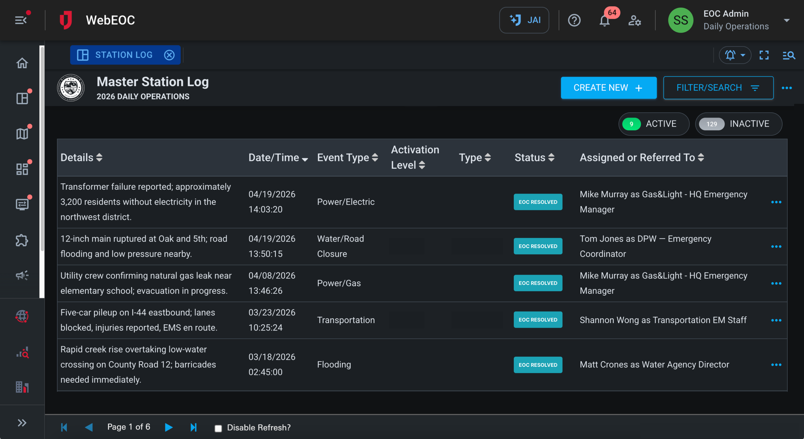
Alright. Thanks, Jeff. So, yeah, this is an exciting, new integration that we have in WebEOC. It allows for, taking that very powerful power outage data, bringing that into abort into your WebEOC system.
It includes, you know, many different areas that we’ll touch on, even down to the polygon and, you know, point level for the different utilities, providing that neighborhood level view of impacted areas. We got at a a glance dashboards really to help with that situational awareness and help to drive decision making. And, also, you know, obviously, as Doug said, their API if they’re if you wanna do more custom integration work. But with that being said, let’s let’s dive into it.
I’m gonna go ahead and grab the screen here and walk you through what we got.
Alright. So can you see me, Jeff?
Yes, Matt. We see you.
Perfect. So we’re in WebEOC Nexus, the latest and greatest version of WebEOC. This is our home page where, we have a number of different integrations. And today, we’re gonna focus on, obviously, power outage.
And so, with with the power outage, integration, again, I can access that through that home page. That’s gonna pull up, it’s gonna pull me right into the states tab. Now these different tabs can be permissioned out as appropriate. And, obviously, if you’re, you know, only focused on one particular state, then this would be limited to that state.
We have, you know, all, all states pulling in here. And, from this, a couple things to point out. You can see it’s sorted by the largest number of customers out.
It will group them, so in different ranges. So you can kinda see the ranges up here. These are actually filters, so I could filter down to, the particular areas I I wanna see. Obviously, good thing right now that we don’t have a huge number of outages in the US.
It looked, the the numbers were much larger, as Doug said, a few weeks back, but we we can’t control that, obviously. And and, again, it’s a good thing. I’m gonna dive into, well, one other thing to point out here. You can filter by the last seventy two hours, or the last forty eight hours or the last twenty four hours, and this will kind of adjust these graphs.
And then in these graphs, you can hover over, and it will show you at this at any point in time, you know, what those numbers were at those different points in time. And, obviously, this is very different than what you see on, what’s publicly available for this data, which is really just the the current number. It doesn’t have this historical data, which is one of those, nice things about this, some of the value that this integration provides. If I dig into Texas here, I can see a lot more detail.
Again, the number of customers tracked, the number of customers out, as well as this historical element. I can expand the number of records that I’ve stored here. And, you know, this is just the last, you know, just last couple days or the last day. And, you know, you can go through the different pages of the history.
It’s all being stored in the system, and you can kinda see how those numbers have evolved. This is being updated every ten minutes. We can adjust that to be more frequent or less frequent. That’s just the way we have it set up, in this particular environment.
And at the bottom here, we have a similar type of graph where I can hover over and see what the outages were at any point in time. And this really helps to see, like, are we on a, you know, good trajectory where, you know, things are coming back or, you know, the opposite of that where things are getting worse?
You have that insight by, having this historical context to provide. Taking a step back, to the state view here, you can also go and filter by the state, But let’s kinda move on to some of these other areas. So let’s just say we you know, this would pull in all the counties that are applicable. And so right now, I’m in Georgia.
Jabari is based out of Atlanta. So I have all the, the Georgia counties here versus, you know, bringing y’all, you know, thirty five hundred plus counties that are in the US. So, with the Georgia counties, it’s once again sorting by percentage out. Luckily, the numbers are pretty low.
The number of customers out total, same sort of functionality in terms of being able to hover over and, and see, those numbers, over that period of time with a similar ability to change the period of time that we’re looking at, from, you know, three days, two days, or or or one day. You also have the ability to filter by the percentage, out here.
And, luckily, again, everything right now is is less than five percent. So that’s a that’s a good thing here in in the state of Georgia. Once again, I too, I can go in here, and I can I could filter again by that percentage or maybe search for a specific, county that I’m looking for if there are a large number?
Similar story with, cities.
And then but I wanna move to utilities because this is this is pretty nice functionality. So, with utilities, this is pulling in all the utilities, for a particular, you know, state or the areas that we’re we’re focused on. So in Georgia, there’s, you know, many different utilities. Georgia Power being the biggest one, and, of course, being the biggest one, they have the largest of, customers out right now, which is what this is sorting by.
Again, similar ability to, change the chart interval here and similar ability to drill into that particular, utility and see a lot of detail for that utility. So you can see here I have the number, the the history that’s coming in frequently here. You can see that they they’re sending data to us, again, every ten minutes. But every ten minutes, we’re getting data for every county that they’re serving.
So you have that county breakdown. So you can see, you know, where where is that number actually coming from. You can see, how the breakdown, is per county, which is really helpful. Again, you could expand the number here, and, you can see that breakdown of all that.
And then if I scroll down to the bottom here, then we have our total count for that particular, utility. So this is cumulative, obviously, for all the different counties that they’re serving. But the county breakdown is really nice because it can point out where where your issues are in terms of, that. And you could also I could also go in here, and I could filter by that particular county and then see the history of of that county from that utility.
So just just a little bit more granular detail as we’re trying to figure out what’s going on. You also have our graph down here, which once again, I can hover over and see the different how these numbers are are changing over time. So pretty powerful, functionality there. I’m gonna keep moving.
We also have some dashboards.
The national dashboard will, be cumulative across all of those states that we’re, looking at. And so in this case, we have, you know, all states and and territories, and so we have a total number. It will highlight the ones, where there’s, you know, major outages in cities, also, recent planned outages, current outages. And then this is kinda nice.
This is just a graph showing the the breakdown of the, customers by state, sorted by the the largest. And then this also is a a map that would indicate whether there were were, it would highlight the areas where there are the biggest challenges. And, luckily, right now, minimal, minimal challenges, with outages, so that’s a good thing. Now we go to the state dashboard.
This is gonna be, take all the data from the counties and roll that up. So this is all the you know, for Georgia, the outages. You could see that just number just changed because it’s constantly refreshing as we get new data.
Current number attract, is fairly consistent. And then this will highlight where there’s counties experiencing outages versus major outages. Luckily, no major outages right now. And then we can this is sorted by the largest number of customers out by by county.
Final dashboard is a county dashboard. Not a lot going down going on here just because of the nature of looking at the you know, not a lot going on there. So, final couple things I wanna highlight is the, current outages. And so with the current outages, we can see the, the points and polygons, for the the very granular data that’s coming in from the utilities.
Now this is very busy because we’re pulling this in across the nation. But, of course, if we’re only pulling in for a particular state, it would be, you know, a little less busy. So we’re only looking at the last day, and there’s two hundred and eighty five pages, I think, of two hundred fifty records per page. So there’s a huge amount of data here.
This would obviously be scaled back if we’re only pulling in data for a particular state. This allows you to go kind of see that much more granular data of of the very detailed, reports, from these utilities. You can also zoom in to the location of of where that’s happening very specifically and, allows you to you know, it’s got more data coming in here, as it’s refreshing. And you can also go three days out, seven days out, thirty days out for that.
The final thing I wanna show is the planned outages. And so this is gonna show you all the data for any planned outages. Now the thing with planned outages is there’s not not all states do planned outages. California is one that’s that’s known for a lot of planned outages.
And so, but any states that are doing planned outages, that would be shown in your planned outages area. Once again, you can see them in the table. You can see the details of it when it started, when it’s, recorded. You can zoom into the location of that, and, this is that very granular planned outage information.
Most of these are showing as points, but we also have polygon data coming in here. And so that’s, most of the things for this particular interface. You can utilize this data in our analyze tool, which is like our Power BI type of, tool for more robust, dashboards and things. So, some folks are doing that.
We can also do additional alerts in WebEOC using WebEOC alerting. So maybe when, the number reaches or goes over a certain, threshold, we can also send out alerts in addition to some of the alerting that, Doug mentioned earlier. And so there’s just a lot of different other kind of expanded use. You can also bring this into the mapping, maybe share this with ArcGIS via our, Esri ArcGIS integration.
So lots of expanded, ways to use this tool, and and, obviously, we’ll continue to make this better over time as we, get additional feedback. So I’m gonna go ahead and stop there and, hand it back to Jeff.
Thank you, Matt.
Go ahead and get my share started here.
Share. Share.
Okay. Thanks, Matt. That was great. So before we move on to questions, I want to bring up our upcoming webinars and and invite you personally to join these.
Weather Optics on April fifteenth, that’s a that’s a great weather webinar we plan to do. They’ve got some cool AI stuff coming in on their new on their new products. SenseNet wildfire detection on May twentieth and IceEye flood detection on June twenty fourth. So please join us for those.
If you wanna learn more about anything you’ve heard today, please reach out to me directly. There’s my email address or to dougbocha at power outage dot com. You can request a demo from the Jovari website, or you can go to see our all of our partners at the Jovari website for partners, Jovari dot com slash partners.
I know we have a bunch of questions, so I wanna pull up some of those.
Let’s see. Questions.
Okay.
So first question, we’ve had a lot of major outages recently. What have been some lessons learned from those outages?
Probably maybe that’s a Doug question.
Sorry, Jeff. I’m going through the questions on this. Can you repeat that, please?
Sure. Sure. Sure. So so there’s been a lot of outages recently. What have been some lessons learned from the outages that we’ve had from recent storms?
You know, I would say that I I’d say that that there’s lessons, but there’s also reminders. Because it seems that sometimes outages come in waves.
And I think with the number of hurricanes that were predicted this last summer, it was supposed to be an incredibly active year. And thankfully, we you know, the East Coast did not wind up getting hit.
I think some of the lessons learned is that much like what I said in the beginning, at least from the utility providers, is that weather is getting significantly more extreme. And it’s you usually don’t have back to back historic storms in a matter of a month. So I think the preparedness of what’s going to happen for utility providers, you know, unfortunately, there was a pretty significant ice event in Texas, you know, a few years ago that kind of changed regulations and and how they hardened that grid. The same thing’s going on across Northern Mississippi and Tennessee.
I think it also has kind of what we’ve seen is a tremendous amount of outreach from additional clients that were impacted by the storm, really feeling like they got caught flat footed and really wanting to be able to understand, like, when outages are gonna wind up impacting business operations and how they can wind up mitigating those events. So I think it’s just a reminder that that that, you know, this is something that has you know, it can have profound effects when it happens. It is incredibly disruptive. I mean, you have to do is look at your, you know, personal life to to realize what it’s like.
And from a business perspective, being able to you know, it as I always kinda say to our clients, like, business moves at the speed of data these days. And having access to data at your fingertips when it comes to outages and being able to react in real time will, I think, pay dividends for those that have it and really be able to mitigate the impact of those those outages in the future. Future.
Great. Thanks, Doug. I’m gonna cover a question here that that Matt Hope answered a minute ago. Matt, if I can put you on the spot. What states, regions, or territories have the most data gaps? For example, is there accurate data for Guam and Saipan?
So yeah. Thanks, Dominic, for that question. I’m checking into to Guam and Saipan at the moment. So the the reality is right now, we’re covering three percent of US electric customers.
The the customers who are primarily not covered I’m sorry. The the three percent that are not covered, we’re covering ninety seven percent. The three percent that are not covered are primarily coming from very small municipalities or cooperatives who, maybe due to budgetary constraints, but for some reason or another, they don’t have a, an an outage, tracking system that they would allow that that they have that we have access to or that’s publicly available. So the other ninety seven percent of US electric customers, they have utilities that are actively publishing this information or are feeding it to us directly.
So if there’s, like, a concern with a specific state, we had a question on a specific state as well, the state of Colorado. So the the example here, to answer Lewis’ question, in Colorado, there are three point let’s call it three point five million customers. And just to clarify, a customer equals a meter. Right? There’s one meter per house or business prime usually. So three point five million customers in Colorado, and we cover over three point three million of those customers, leaving about a hundred and ninety thousand that are members of small cooperatives or customers of small municipalities that don’t have an outage management system that we’re able to access.
So we’re happy to happy to let you know specifics about certain states if if it makes sense.
Thanks, Matt. And and since you mentioned coops, Holly asked the asked the question. I think you just alluded to it. Are private coops for rural areas available? If you would share that answer, it would be great.
Yeah. Absolutely. So there are a hundred and sixty five approximately a hundred and sixty five million US electric customers. And about about two thirds of those are served by investor owned utilities or IOUs. Those are the the big ones, the big names that we’re all familiar with. And then of the remaining third, about half of that is served by cooperatives, and about half of that is served by municipalities. So that ninety seven percent US electric coverage US electric customer coverage, that includes cooperatives and municipalities.
So we we do cover hundreds and hundreds of cooperatives, and the same is true for municipalities as well.
Great. Matt, one more. What are the biggest challenges that emergency managers face when trying to understand the scope and the impact of a power outage?
So currently, there’s no standardization for how a utility is reporting this data. So there’s no there’s no requirement on the utility, and there’s no requirement on the different outage management vendors. So the different systems report things different ways. Right? So one of the big things that we’re working towards is to try to normalize this data, to normalize the signal so that across an area, whether that be a county or a state or a region, there’s a very clear understanding of the outage events and how severe they actually are both in time and in impacted customers. So that’s that’s a big piece of of what we do with this data as we’re as we’re bringing it in from these thousand plus utilities, aggregating it, normalizing it, and redistributing it via our API.
Great. Great. Let me ask another one from Lee. Does your database include real time PSPS notices?
So when the utility provides those PSPS notices, they they are included in our API, and that would be fed into whether you see via our API.
And and just but to expand on that, utilities can provide PSPS warnings either days, weeks, or sometimes even months in advance. So as soon as they make those PSPS warnings available and notices available, we we pass them through on the API.
Fantastic. Thanks. This one’s from Ryan. How real is real time? Is there a range of time delay on utility OMS power outage API is matched to real conditions in the field that you’ve seen?
So how real is real time? Great question. Different utilities, their OMS systems will have different capabilities. So there are the the larger the utility I I think that the the rule of thumb here would be the larger the utility, the more resource they are, the the the more up to date their OMS system will be. Right? So that many of these utilities are updating every one minute, every four minutes, somewhere in that time cadence. Currently, our system updates every ten minutes, and we do the nationwide snapshot to see what has been what has been updated by each individual utility.
We’re moving to sync a little bit more real time so that if a utility updates every one minute, we will as well for that utility. There are some OMS systems that exist out there, that are maybe more budget friendly options that might only update every fifteen minutes, every twenty minutes. There’s a few different cadences out there. So we take the data that is the most recent and pipe it into that ten minute snapshot.
Great. Thank you. Matt, you answered this one for for Luke already, but I’d like to ask it for the whole group, so everyone gets, to hear this. How do you tell when a provider’s OMS stops reporting data?
Will such disruptions to be displayed in WebUC along with the time stamp?
Yeah. Lou, great question. So we’ve part of our our role here as this aggregator of this data is that we’ve set up a series of different types of alerting systems that we are monitoring, essentially twenty four seven. And so we’re getting alerts all day long if if something changes on the utilities and for us to go and check and make sure that didn’t disrupt the feed of data coming to us.
And with the team being online as as frequently as we are, the the common the common response of an alert where there’s an actual disruption is that before that next step snapshot, we’re able to reestablish the feed. These are usually, like, pretty pretty small interruptions that would not create any gaps in the data.
When disruptions are made, yes, we are logging them. So, Luke, to your question, at the start here, there is not an integration that’s where it would be displayed in WebEOC.
Feature request heard, and that’s something that we can can look towards in the future.
Great. It looks like we’ve answered all the questions.
Any other questions for for the group?
Please type them into the QA panel.
Okay. We’re not seeing any more, so I will wrap this up. Thank you all for coming. We appreciate your time. Have a great day.